Sunday, December 30, 2012

The Wardrobe Dilemma

Image from Multi-Store and Bunnings

I can't believe we're up to fit out stage and I haven't finalised (or really even given much thought) to the wardrobes. Originally I was just going to ask the builder to leave all the spaces bare and I would "design" and create all the cabinetry myself. Then I went to Ikea and saw how expensive the inserts were. The building contract included a full length top shelf, 3 side shelves and a single rail so I thought I would at least get them to do that and perhaps I could retro fit it later with all my fancy drawers and shoe racks when I was a little more financial. All the bedroom cupboards have a single cupboard door and two double opening doors.


Image from Multi-Store
Mum needs to build in a wardrobe in her bedroom too so I tagged along on a trip to Bunnings and saw these inserts from Multi-Store that can go straight in around the existing cabinetry or if I get them early enough the builder could probably build around them. It's really only the drawers I'm concerned about. I like having drawers for underwear and socks as opposed to shelves, especially high shelves as they tend to get very messy. The "Econo 515" is the one I think would work behind the single wardrobe door. It's $360 from Bunnings...not the cheapest, especially if I need to get 5 (will put 2 in the walk in wardrobe), but I think that will still be a fairly cheap and effective option in the long run.

Image from Multi-Store

The other option is the Maxi 450 which is only $219 and would also work...but I don't think as well as the first option.


Saturday, December 29, 2012

Shower Niches


Instead of shelves or those shower caddies that hang over the shower rose, I wanted to have niches in the bathrooms to hold shampoos and shower gels etc. I think they look a little neater and tidier than caddies. The builders have put in one that spans almost the entire width of the wall, which I'm so happy with because originally they were only going to be quite short. They're not very deep, but because they're so long I think it will be OK.

The niches are in the main bathroom and ensuite upstairs, but unfortunately not the guest powder room downstairs. There was a pipe along the only wall it could go on so that will have a single glass shelf.

Thursday, December 27, 2012

Last Photo of the Year


The builders have finished up for the year and this is how the house looks from the street. Considering it's been less than 100 days since they started, I think that's pretty good progress. 

After I took this photo I sat in the car and reflected on the rebuilding journey so far, and that dates back much longer than 100 days. It pretty much started the day we began the clean up after the flood. I knew even back then that the damage was so extensive that demolishing and rebuilding new could be a possibility.

While is hasn't all been easy, it's certainly been a learning experience and one which I'm surprised to say I've enjoyed to the point where I might be considering a career change.

I also thought about all the people that have helped so much on this journey so far. Working at building company certainly has its advantages and everyone there from the building designers to interior designers, estimators to chippies have been so generous with their professional and invaluable advice. Other friends and family have all been amazing in their special way, from advice to recommendations to time and sometimes just a friendly ear for me to vent.

From such a hopeless situation with some very dark days to one that will feel like a completely fresh start, I think there has definitely been a silver lining in this project and I'm incredibly grateful.

I'm really looking forward to 2013. 

Thank you for being part of my journey. xx

Monday, December 24, 2012

The Nook at the top of the stairs


This is the study/reading nook at the top of the stairs. I just love the idea of this little spot. Even though I'm not a great reader of books, I do love magazines and I could imagine curling up on a comfy chair, cup of tea on the lamp table and losing myself in the latest Home Beautiful.


With this chair from Retrojan

This side table from Life Interiors
 

With this cushion from Tracy Ellis from Aura Home


And this arc lamp from Freedom Furniture


This is what I was thinking for the book shelf and study part along the back wall. I thought about putting together some pieces from the Hemnes Range from Ikea, but I think it will probably be better just getting a cabinet maker to custom make it.

Can't wait!

Moroccan Lights


I went home decorating shopping with my cousin and she wanted to go to Hamimi - a Moroccan homewares store in East Brisbane. I was pretty curious myself actually as I drive past it almost every day and it looks exotic and mysterious.

Inside they had a stunning display of pendant lamps covering the ceiling and it reminded me of being in  a crowded Middle Eastern market at sunset.

They totally don't fit in with my mid century theme for the house, but these lamps are absolutely divine. I would love to be able to put the outside, maybe in an outdoor room in the backyard or even out on the balcony.


Sunday, December 23, 2012

Stairs are in!


Yaaay the stairs are in!! Hallelujah! I have spent weeks climbing up and down a ladder to get to the upper floor and in heels and sometimes a dress (I usually go before or after work) I have to tell you, it's not easy.

I chose Kwila for the timber, which was a step up from the standard Durian and I think it's come up nicely. They still have to put a clear coat on it but that won't be until towards the very end.


The only dampener on this is that it's not designed as I had originally intended. Above is how I'd originally planned for the staircase to be - open to the ceiling. I didn't even realise until the plasterboard went up on the wall enclosing the staircase as it's hard to read on the plans. But the design of my house compared to the design of this is a little different as mine has the reading nook at the top of the stairs. This means that wall is a load bearing. I decided that it wasn't worth losing the value add of a study nook for the sake of an open staircase.

Friday, December 21, 2012

Pendants Over Breakfast Bar (Part 2)


Last week I was concerned about the size of the pendants over the breakfast bar. I had always intended to get the silver Ikea foto pendants which are about 28cm wide, but when I was there to buy them I saw these gorgeous white ones which looked like better quality. The only thing is they are 35cms which I thought might be slightly too big.

Now that the cabinetry is in, I don't have to speculate. I put them on the bench to have a look but...I still can't decide.

So I've deferred to anyone who will listen and opinion is divided.

Those in the yay say it looks slightly "industrial" and makes a statement, but not too bold as the white blends in with the rest of the kitchen.

Those in the nay say it looks too big and the white is too insipid against the rest of the kitchen and the silver smaller ones would be more suitable.

I'm really stuck with this one. I'm leaning towards thinking they may be slightly too big, but perhaps if they were up high and not too low down on the bench it will look OK. The quality of these white ones is much better than the silver Foto ones, as they just look like flimsy painted plastic when you look close up.

Help!!

Wednesday, December 19, 2012

Day 91 - Cabinetry is in!

Kitchen
This is the last day before the builders finish for the year and the cabinetry is in! Overall I'm pretty happy with it. It's light and bright and they way it was designed. There are no handles on the cabinetry, the tops of the doors are on a 45 degree angle so you can pull them out. The only thing I don't really like is that it is on a sharp angle, I thought it might be a bit softer, but I guess that's because they are laminate and not 2Pac.

Main Bathroom
I was so, so worried that the cabinetry in the main bathroom would make the space really small and squishy but it has come up perfectly. The only thing is that the right hand cabinet is supposed to have a door that looks like drawers so they are even.


Same with the ensuite cabinetry. The door on the right is supposed to look like drawers (even though they're not) so they look symmetrical.


This is the cabinet outside the toilet. This was a bit of a luxury, you could easily enough just go into the main bathroom to wash your hands, but I really prefer that it has its own, in case someone is in the bathroom already.

Obviously there is still the stone benchtops to go on top and it will look more finished, but I'm reasonably happy with how things are progressing.


The laundry doesn't have stone benchtops, I just sent for a square edge laminate which I think looks fine.

So that's where we're at for Day 91!

Sunday, December 16, 2012

Dining Chairs

Not sure if I mentioned it on this blog, but I moved about a month ago to a smaller, unfurnished apartment. I put something on my other blog. I've been lucky, the past 2 places we've been in since the flood were fully furnished, so I haven't needed to buy anything. But as this place is unfurnished, it's been a bit of a conundrum whether to buy anything or whether to just wait until the new house is ready and save on moving costs.

The only furniture we managed to save from the floods were Josh's single bed, my queen bed, a small pine table and 2 bedside tables as they were all solid timber. This apartment is quite small so there's not much room for extra furniture anyway.

One thing that is important to me though is eating at the table. I think it's important to try and eat together and not slump in front of the TV like zombies. Of course I have exceptions, like weekends or burger night or take out night, but mostly I love gathering around the table to eat and discuss your day, even if it's only once a day and there's only two of you.

So...

At the moment, we have no dinner table. Or chairs. I bought a couple of bean bags and that's it and to be honest, the novelty is wearing off and with at least 8 weeks to go this arrangement is going against all my principles.

OK...didn't that cut a short story long? The point I was getting to is...I need a dining set.


I've had my eye of this table from Life Interiors for ages and although I've looked around, I keep coming back to it, so this is it.


These replica Hans Wegner Wishbone chair is what I had my heart set on to go with the table. I had a revelation the other day though when I saw something similar and realised the chairs would never fully go underneath the table. This would drive me mad.

So I have to find an alternative.


I love this, a replica Hans Wegner Elbow chair. Totally gorgeous, but almost $400 per chair!!!


This is a much more economical choice, a Classic Bistro chair at $189 per chair. The only thing is that it's not made from walnut, but can be stained walnut to match the table. Not sure if knowing that will always drive me crazy.


Otherwise this Short Back chair, even more economical at $165, but again not made from walnut but can be stained.

What do you think?

Saturday, December 15, 2012

Bathroom Dilemma - Tiles (Part 3)


I finally made a firm decision on the bathroom tiles. Ta-dah!! This is the selection. The super white tile is the wall tile and one with the fleck is the floor tile. The little sample on top is the cabinetry colour.

I thought this would be the end of it, BUUUUUUT no!

I wanted 300mm x 600mm on the floor so it looks as seamless as possible. It seems though that there is the same issue I was having with the timber look tiles being too long for the fall in bathroom and they will need to be cut. Actually, worse still he was saying they will need to be cut and laid on a 45 degree angle near the drain. It would have been OK if there was one of those long grates, but that needed to be designed from the beginning and definitely decided on before the waterproofing went down. He said it would be much better to use a 300mm x 300mm square tiles, which I definitely DIDN'T want.

This issue has been long and protracted and starting to get me down.

I don't know what to do. Should I just use the 300mm x 300mm tile as suggested and just put it down to experience, or use the 300mm x 600mm and have smaller tiles around the fall of the drain.

Help!!

Close up of the floor tiles. I do love them. They look like stone but are a rectified porcelain

Wednesday, December 12, 2012

Pendants over the breakfast bar


The saga of my indecisiveness continues! I was at IKEA on the weekend buying all the pendant lights for the house. Previously I'd said I was going to put three silver pendants over the breakfast bar, but I saw this one and changed my mind.


This is what the kitchen will look like (with white benchtops, not black). The three pendants will sit directly over the breakfast bar.

I switched to these white pendants as the rest of the kitchen is white, however I am a little concerned they may be too big for the space.


The original silver pendants I chose were 25cm and the new pendants are 38cms. The breakfast bar is 2.7 metres.

What do you think? Too big or not big enough?

Tuesday, December 11, 2012

Door handles are on


Yay the door handles are on! I'm pretty happy with them. This is the front door handle and lock and I think it makes a nice statement.


This is the door handle on the garage door. It's just a simple lock but I think it looks nice and contemporary.

Monday, December 10, 2012

Bathroom Dilemma - Tiles (Part 2)


In my previous post about my bathroom tile dilemma I was considering a grey tile. Today I visited ONE more tile supplier and quite like this white stone tile with a slight fleck to it.

In this pic, the wall tile is on the right and the tile I am considering for the floor is the third and fourth down (matt and polished). I am worried about the hair and dirt showing on the floor, but I'm hoping that the fleck will hide that.

I desperately need to make a decision on this as the builder wants to start laying this before Christmas.

What do you think?

Day 83 - Pillars are rendered, external stairs are up


So much is happening so quickly...I just love coming to site and seeing the progress. They will shut down over Christmas for at least 3 weeks and after that progress will be much slower as tradies are on holidays and suppliers are closed. I think I will have a bit of a breakdown being so, so close to finished and moving back in and everything just coming to a screaming halt.

Oh well, let's deal with that when it happens.

In the meantime, I'll revel in the current progress. Firstly and most noticeably from the street is the pillars have been rendered and are ready for painting. Originally these front pillars were 470mm wide. Quite huge. They really were a dominating feature of the facade and I wasn't sure why. It was the builder that had suggested that they needn't be so wide so I asked the designer if they had to be that big. They didn't. So we reduced them to a more respectable 350mm and I think they look much more in proportion.

The pillars will be painted a light grey just to make it slightly different from the rest of the house.


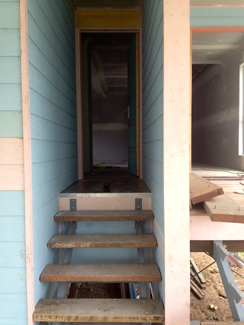
The stairs and portico from the garage up to the garage door have been created. I'm not sure how they are going to finish them - I will have to clarify. I would like them stained.


The front door steps aren't yet completed. The timber they've used is spotted gum. I really love the colour and grain through the timber. There will be a timber handrail on the right of the portico, but at this stage there isn't one at the bottom of the stairs as the slab is less than 1 metre off the ground. The builder did say though that he thought it looked a bit dangerous and they were considering either putting another handrail or adding some fill to the ground to build it up a bit.

Don't you just love progress?

Bathroom Dilemmas - Cabinetry


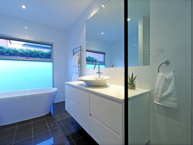
This bathroom was the inspiration for the original cabinetry. Timber look door fronts with  white stone bench tops in the background of white tiles. Just beautiful right?

Sadly the door front covers weren't available and the bathroom is actually a lot smaller than I had anticipated. So, to make the space seem bigger, we decided to make all the cabinetry white and chose Formica Snowdrift Gloss Plus.

I hesitated on this decision for ages because I couldn't visualise how it would look in my mind and like the issue I'm having with the tiles, I'd chosen the colours long ago and find it difficult to then go back and choose something else.


Because I'm finding it hard to visualise, this is what I'm afraid it will look like. Not that there's anything wrong with this, it's just not the look I was after for the bathroom. My bathroom is a little different in that it has stone benchtops, no handles and is wall hung so doesn't have these feet. So definitely won't look exactly like this, but I still worry.


I found this pic on this website though which I think is more along the lines of how my bathroom is designed. This appeals to me much more and I'm hoping it will look more like this.

Do you think it will look like this?

Saturday, December 8, 2012

Bathroom Dilemmas - Tiles

I'm really struggling with my bathroom selections and I'm not really sure why. With everything else, from demolition to design I've hardly hesitated with my decisions. I generally decide on something and run with it.

The issues I'm having is with tiles and cabinetry. This post is about the tiles. Actually, I can pinpont why I'm having so much trouble. Both tiles and cabinetry were selected ages ago, but both are now not able to be used so I had to select something else. I find it very difficult to go back and make new decisions when I've already made one previously. It's like my mind has put that away and moved on.


In a previous post I'd written about these GORGEOUS timber look tiles that I'd fallen completely in love with, despite being $144m2. I could see in my mind how they would look and had my heart completely set on it. A couple of weeks ago though the builder said the tiles were too long to be able to get fall in the bathroom and would need to be cut in a number of places and would look terrible. So I was back to square one.

I've been to SOOO many tile places but I always seems to have these in the back of my mind. It makes selection very difficult. I had then decided on an all white look look, but you can't find a pure white floor tile because of the way they are made. So I had to go a different route.


OK, the tile at the bottom is the wall tile. Just a basic ceramic rectified tile in a pure gloss white. The tile at the top is my thoughts for the floor tile. I say thoughts as I'm still unsure. It's a cool grey tiles, semi gloss and looks a little like brushed aluminium. This is so far away from my timber look floor I'm still struggling with it.

What do you think?

Thursday, December 6, 2012

50 (more) shades of freaking white!


You might recall my last shades of white dilemma when I was trying to decide on external paint colours for the house. I thought that white was white, but it turns out it wasn't.

I had a serious case of deja vu when I had to pick the colours for the cabinetry in both the kitchen and the bathrooms and laundry. I had to choose a laminate colour. Turns out there's 50 shades of freaking white for laminate as well, combined with a stack of different finishes to add to the confusion!

But, like I always do, we'll go simple and conservative. The theme throughout the home is cool white, so I chose Formica Snowdrift in Gloss Plus.

 I would have loved to have had 2Pac, but it was just too expensive and I've already gone over budget on other things. Oh well, the cabinetry is being crafted as we speak. Very exciting!!

Tuesday, December 4, 2012

Latest Internal Pics

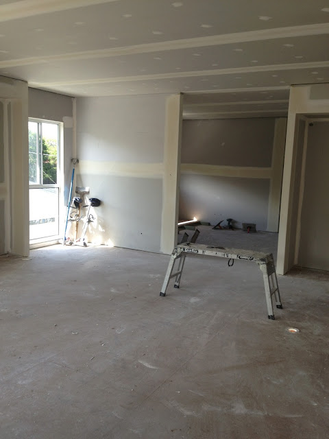
Wow it's only been a week and the plasterers must have been working pretty hard because they've made amazing progress! Here are the latest pics.

Back Deck

Master Bedroom

Study nook at the top of the stairs

Kitchen
Upstairs Toilet

Hallway looking toward the front of the house

Garage Entrance

Living Room

Walk in Pantry